
Unlock the potential of your research data on your own terms. Watch this webinar from Almaden Genomics and BigOmics Analytics showcasing the seamless integration of g.nome® and Omics Playground, simplifying the analysis process for biologists. Discover how our integrated platforms empower biologists to effortlessly navigate analysis pipelines, ensuring timely insights and enhanced understanding of complex data. Using colorectal cancer data as a focal point, witness the transformative power of streamlined data analysis in driving impactful genomic research.
Key takeaways:- Innovative Solutions in Genomics: Discover the advanced analytical techniques and tools that Almaden Genomics offers to make complex data comprehensible and actionable.
- Expert Guidance: Gain insights from industry leaders like Kit Fuhrman and Axel Martinelli on how to effectively utilize omics analysis in your research to achieve faster and more reliable results.
- Empowering Biologists: Learn how biologists, regardless of their computational skills, can benefit from enhanced omics tools to drive significant advancements in their projects and research outcomes.
This webinar is a must-attend event for biologists seeking to leverage the power of big data without the need for deep technical expertise. Whether you're a seasoned researcher or new to the field of genomics, you'll find valuable insights and tools to enhance your work.
Watch the webinar now and empower your research with fast, meaningful insights that drive real-world results:
Moderator

Director of Business Development
Almaden Genomics
Hannah Schuyler graduated from The University of Texas and spent the beginning of her career focused on using digital analytics to inform a marketing strategy for pharmaceutical, biotech, and medical device clients. She has spent the last few years working with clients to help them identify data analysis solutions for NGS and genomic data.
Speakers

Senior Director of Product Management
Almaden Genomics
Kit Fuhrman is an experienced product manager in the biotech industry. Dr. Fuhrman has built impactful products ranging from NGS sequencing reagents for translational scientists to spatial biology platforms for pioneering researchers. He has a doctorate from the University of Florida in Immunology, studying the role of regulatory T cells in type-1 diabetes, and a master's degree from the University of Central Florida, studying HIV entry inhibitors.

Axel Martinelli, PhD
Head of Biology
BigOmics Analytics
Axel Martinelli holds a PhD in malaria genetics and pursued an MSc in Bioinformatics at the University of Edinburgh. During his postdoctoral career, he worked on genomics and transcriptomics studies at institutes such as the Wellcome Trust Sanger Centre in Cambridge, UK, and Hokkaido University in Japan. In 2019, he assumed the role of Head of Biology at BigOmics Analytics, a Swiss company specializing in developing data discovery platforms for omics data analysis.
Transcript
Hannah Schuyler:
I think we're going to go ahead and get started. Thank you so much, everyone, for joining. My name is Hannah Schuyler and welcome to today's webinar—fast, meaningful insights: simplified omics analysis for biologists. As I mentioned, my name is Hannah Schuyler, I'm a director of business development here at Almaden Genomics. And joining me today is Kit Fuhrman, who leads our product and development team. Joining us from the BigOmics team we have Axel Martinelli, who is their head of biology, so thank you again for joining.
A couple of things before we get started. This webinar is being recorded and will be sent out to all attendees after and will be available online as well. Please enter questions that you have for the presenters in the chat box and they will be addressed at the end during the live Q&A session.
In terms of what we'll be discussing today, first we'll be highlighting our end-to-end solution and the importance of being able to process your sequencing files all the way to tertiary analysis with both of our solutions. Then it will give you an overview of the dataset we'll be analyzing today, which is a multiple myeloma data set.
Then we will go through a demo of how you can actually use the g.nome and Omics Playground softwares to process your data. And then lastly, we'll leave some time for Q&A. If you have questions again, please enter those in the chat box for us. When it comes to analyzing data, there's many complexities that make it very challenging.
There's of course, massive amounts of data across different teams and work streams, making this very difficult to manage the data in one secure place. There is also often a communication gap between both the biologists and the bioinformatician. I'm sure, as many of you know, it's a very iterative process when it comes to analyzing the data. The biologist often relies on the bioinformatician to analyze the data so they're not necessarily self-sufficient.
And specifically for tertiary analysis, there's a surplus of open-source solutions that aren't always updated, regularly regulated or organized, making it very, very difficult for the biologists to do the routine analysis themselves. This, of course, slows down the data analysis process and time to insight and discovery. And then lastly, there's a need for transparency and organizational systems to track and reproduce methods for experiments in the future.
With all of that being said, we're looking to provide an end-to-end solution for researchers. Of course, that first step really begins with data, right? It's whether you have your in-house sequencing data or public datasets that you're looking to analyze, all of that data can be brought in to the software and we provide the ability for users to securely manage the data through different workspaces.
The next step is really around data processing. You can start with some of our pre-built workflows and use as-is, you can modify it, or you can build a pipeline from scratch. The next step is focused on the tertiary analysis and this is really where our partners BigOmics come into play and excel at this type of analysis. They have access to over 100 different visualizations that allow you to compare datasets. You can perform pathway analysis, genes that enrichment analysis, explore where the drug connectivity and mechanism of action and many more types of reports. And then lastly is a service component. We're really focused on providing kind of that white glove treatment in terms of customer support and training with all of our customers.
We also can build custom bioinformatics workflows and curate and clean datasets for processing. Today we're going to talk through how you can actually use g.nome for data processing and automation, and then take those outputs from the software, which are a process data file, and then visualize that data on Omics Playground. Before I pass it over to Kit to walk through the dataset, I would like to pull the audience and get a sense of where you guys are at with data.
In just a second you should see a map. When do you anticipate you'll be analyzing RNA sequencing data? Right now, within the next three months, within the next six months, within the next year, or I don't need to process any data I'm here to learn. Looks like we're getting some answers coming through. It's kind of all over the place.
It looks like majority of you so far, before I end the poll have data, I would say right now, within the next three months and then within the next six months. It looks like a lot of you have data, which is great to hear. Yeah, thank you everyone for participating. And with that I am going to pass it over to Kit to walk through the multiple myeloma data set that we'll be talking about today.
Kit Fuhrman:
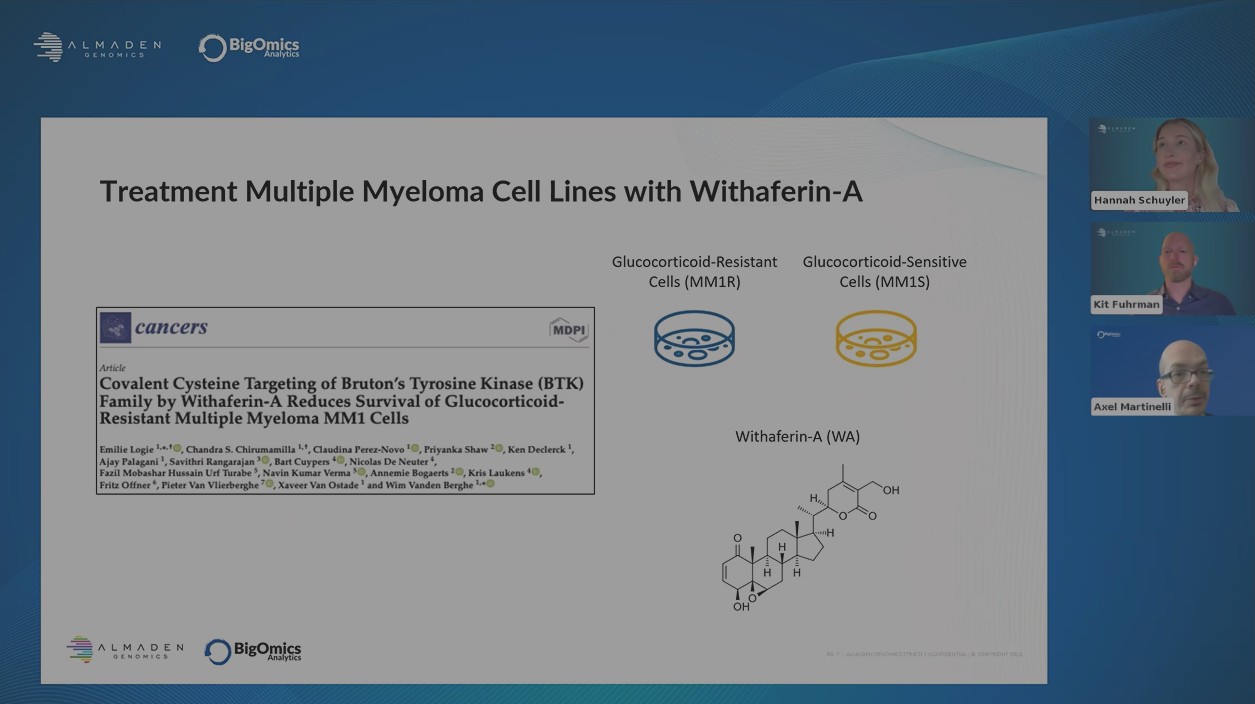
Again, my name's Kit Fuhrman, I’m the head of product development here at Almaden Genomics is excited to share with you the g.nome platform. Today, we're going to use this study on multiple myeloma to walk through g.nome and BigOmics. This is a good publication that explored the ability of Withaferin-A to treat resistance and sensitive cell lines that are resistant or sensitive to glucocorticoids.
If you don't know, multiple myeloma is the second most common blood cancer, and a common problem is that patients will become resistant to whatever treatment they're on, forcing doctors to change treatments. And this process can go on for more than ten years, so it's a very treatable disease, but it does force doctors to just go through repetitive lines of treatment, whether it's immunotherapies or glucocorticoids.
Doctors and scientists are currently on the lookout for new treatments. Withaferin- A is a small molecule that targets tyrosine kinases. And the hope is that this can be another treatment for patients and offer them a stronger response against the tumor. Next slide, please.
We're going to use this data set as an example to walk through the g.nome platform. We're going to download the study data from Gene Expression Omnibus (GEO). The g.nome platform allows you to pull in data from public sources. We're going to run the RNA sequencing work, go to workflow, and then we're going to review the sequencing results and then importantly, download those counts for BigOmics analysis.
Now preparing for our analysis, I just want to review the inputs that we'll use. We'll have four different conditions untreated and treated with Withaferin-A, and then we have our glucocorticoid resistant cells, and then our glucocorticoid sensitive cells, so four groups, three samples in each group. And what we've done is we created an accession list with all the files we want to download from GEO.
We're actually going to download the FASTQ files, so these are rather large files. We can pull out the platform and then process. But you can imagine you could pull in your own FASTQ files from your own sources. We also have a sample sheet which is obviously very important when doing any type of research. We have different conditions. Each file has been labeled with its its actual condition, so we use that in our processing as well as BigOmics.
And then the output from g.nome will be a series of reports and you can review the data and then of course the counts for each gene that can be used in downstream analysis such as BigOmics. Without further ado, I'll dig into the g.nome.
This is the g.nome login page. And here we can see all of the different projects that are available to me. And I can this is how I can organize and store my data in my projects and my workflows. We can create new projects or launch Jupyter notebooks for more advanced analysis. But I'm just going to start off by creating a simple project to download the multiple data files.
I can select that icon and then create a new project. This is a blank project, and we can see we have several tabs here, details page, where we can see a summary information about the project itself. This is where we can connect our different data sources. This is really important. It allows us to connect to either an S3 storage directory that we have available, or it can allow us to upload files from our own computer.
That's a nice feature because we can actually upload quite large files into the g.nome platform if you have them. Today I'm just going to do a good example of uploading the two files that we talked about, that list of accession numbers, as well as the sample sheet. We quickly upload them and now we can see that they're available within the g.nome platform for us to use.
Okay, great. Now I'm going to dig into the g.nome language and basically the power of building workflows in the g.nome. This is really important part of the platform. I'm going to start by going to the “Add” and “Tools” section and I'm going to explain a little bit what these are. I'll type in fastp and you see this is a wrapped tool—it's a containerized tool that contains everything you need to have to run this tool in the cloud. It's completely containerized, it’s version controlled, it has documentation, and we can add this to our workflows, which I'll show you in a second, where we can actually build complete workflows and process data from FASTQ all the way through to process data.
You can pull in, you can imagine you can pull different tools together to string them along, to build your workflow. We're going to start off actually by bringing in a prebuilt workflow. We have a workflow package that we've built out to allow you to pull in bulk RNA sequencing data from GEO. We'll simply add this to our project.
I'm going to show you. The plug and play is kind of a simplified version where you can just connect things and it's a single tile. I'm going to show you the full workflow here and we can see we have our inputs, our variables, and then we have these tiles that encapsulate different functions or tools. In this example, we have our SRT toolkit, which is a common tool used to pull data from the sequencing reads database. We can fetch it and then it'll connect using these wires to different functions downstream.
Through this process, we can build workflows visually without the need to code or worry about our environments. We can just build workflows visually and not have to worry about cloud infrastructure or any of the other things you have to do when you're actually writing code in a text editor.
What we're going to do is just very simple, delete this input pipe and we're going to just pull our accession list to the canvas workspace and then connect it up. And now we've connected this accession list to the workflow. We can save it. You can see everything's version controlled here, save the workflow and then run it and it'll do.
It'll basically spit up all the resources in the cloud that it needs to basically pull down this data and it'll do so in a parallel process, so it's not waiting to do each one individually—it'll do everything together. It's going to pull all the resources so every file that it gets, it can just process that file on its own. It’s parallelized, so that's a really important feature, it saves a lot of time. Things are done quickly because it can spin up the exact research needs for each tool and then shut them down when they're done. No need to keep some sort of instance or cloud computer open in perpetuity to analyze a project.
I could run it here, but it will take some time because actually a very large data sets and so I'm going to back out of here and show you one that's already being downloaded. We just go to our data files. You can see we have our data set and then the project number, it's 81 gigabytes. It's actually quite large. And you can see it contains all of the files. We actually had 24 items, 12 samples pairs and reads, so there's 24 files and it's compressed all of those FASTQ files to conserve space.
And now I'm going to walk through setting up a guided workflow. A guided workflow is a workflow that has been wrapped in a form, and we're basically guiding the user through the questions and things needed to set up the run. It's a much more simplified process. Importantly, we can build guided workflows from a canvas workflow, or we can actually wrap them in a Nextflow workflow. The platform is compatible with Nextflow and so people can use that as their backend processing pipeline.
We can build these guided workflows, which are kind of easy ways to set up processing runs for their sequencing data. We're going to run the workflow. We have basically three guided workflows, two for single cell RNA sequencing and then one for bulk RNA sequencing.
It gives it a default name, but we can change it if you like, and then we just select our data set. Very easy. The great thing here is that it pairs the reads for you so you don't have to do the pairing. You can change the sample name if you like, and if there's ones that you don't want to include in your processing, you can just simply delete those.
But we'll keep everything. And here's an important step where we can use the metadata that we know of our samples for conditions and label each one of these files. Sometimes it’s easy enough to do it manually. You can select control in your experimental groups or change the name to treatment or some other variable, but we're actually going to use that metadata file that we had previously.
And that's a nice way of keeping track of all the metadata when you're dealing with a large number of files. We can see here they've all been set to the appropriate group. Next we can select the reference genome that we like. I'll just use reference genome 37. The count method can vary depending on the application that you're doing. We give the user the of the option to pick between the two most popular ones, we'll just keep it on feature count for today.
And then here we have different variables, optional parameters that you can set. These are common parameters that people want to change depending on their analysis. This will do a static analysis and I'll show you what that looks like here in a second. But you can set these up and then it gives you a nice summary to what you'll be running. This will spin up again all the resources you need to process these 12 samples, and then I'll share with you the output. I won't launch it here because I've already run it, but I can share with you the output of the guided workflow.
Here I have a completed run. We can view the results. This is a great way where it's been organized for you and we can walk through this. We have a few things I want to just point out. We have a pre-trimmed and trimmed alignment reports. These are the multiQC reports for the data sets and I'll just show you what it looks like after trimming.
It gives you the full multiQC reports for every file, every sample here. And probably the most interesting thing is, we have great percent alignment, so everything's aligned aligning to something in the human genome, which is what we expect. We have a high number of duplications, which I think just means that the sample has been over sequenced.
You can see in this graph they've sequenced about 24 or 25 million reads. About half of those are duplicate reads, so a little bit of over sequencing, but nothing to worry about. The data is still great to use.
Another thing that I want to share with you is the differential expression report. This is a feature within the g.nome guided workflows where we can actually output summary results in the form of the reports. This is really nice for routine workflows or things where you need to organize answer whether you're doing some sort of test or a standard assay in your lab and we can build these reports. This one's for bulk RNA sequencing and you can see at the top it gives you a nice overview of the report and what it has to offer.
And the first plot we see is a PCA plot. Real nice here to see that everything is segregated into four quadrants, exactly what you would expect with this type of cell line data. Very nice. We have other plots like an MA plot, you can switch between different comparisons here. This is a downloadable HTML file, you can email this, you can send it to your friends and colleagues. And obviously a heatmap and a volcano plot, static volcano class where you can see the results.
You also get other information as well, individual files. If you want to look at say the heat map that you generated, then you can do that and we can view it here a little more contrast. You can clearly see the four distinct expression profiles from the top 25 differentially expressed genes.
It is really nice to see the differences in your data. And then I think the final thing I'll share with you is that gene counts data and this is simply the place where you can download the files and you have your count files, you have a sample sheet and you can simply download them and I'll give you a little pop up telling you how big the download will be in case it's a large amount of data and confirm it and you'll download that and this is what you'll hand off to BigOmics.
Thank you for your attention. I'll pass it over to Axel.
Axel Martinelli:
Thank you, Kit. And hello, everyone. I'm Axel Martinelli, and I'm the head of biology at BigOmics Analytics. And basically with our platform, we can take over from where the Almaden platform stops with its analysis. And in particular, we can take the counts CSV file that Kit showed you before, and then we can start doing some more in-depth tertiary analysis and visualization of the data.
Let me show you how our platform works. This is where you input the data. This is cloud based solution of course. And you can see here we can select the species, and you can see we now support around 120 species, now the one we are working with is human so I'm going to select that one.
And now here what I can do is go to the dataset that we are analyzing today and I can select the counts CSV five that was produced by the Almaden platform. And then I can combine it with two other outputs, two other inputs that I will describe in a moment. Let me first of all load the data to the platform.
Now you can see that the platform will provide you with a preview. This is the read counts table that came from the Almaden platform. And the good thing is by using the Almaden platform, you already know this is in the correct format for our platform. It saves you really a lot of optimization that you might otherwise need to do.
The sample files is very simple. It just contains the phenotype of your data in a CSV format, which you can easily prepare with Excel. And here you can see the sample IDs. And then we have, for example, glucocorticoid resistant or sensitive phenotypes and treatment. The contrast files is an optional file that you can also generate using Excel, and I'm showing it here to you here because it's one of the optional inputs, but you actually don't need to create that with Excel.
We now have a graphical user interface that you can use to generate your pairwise comparisons. For example, if I go here, I can select from one of the phenotypes. I already created an intersection between phenotype and treatment, but I can also just select glucocorticoid phenotype and treatment. And then you see that the platform generates an intersection between these two groups and then it's just a matter of clicking and dragging.
For example, we can use the resistant untreated as the main group and the sensitive untreated as the control group and this platform will generate a name here that you can edit. Let's just do something simple. Just stick to this. And then you can add this at the end as a new pairwise comparison just by adding click comparison.
Once you have done that, you can go to compute. Now you can select the name of your dataset, you can select a description of the dataset and the type of data you're working with. Our platform supports both transcriptomics and proteomics data, as you can see, and it supports different technologies for all these data types. This is all supported by your platform and then all you have to do is click compute. Now for this example, this is bulk RNA sequencing data, so the default options work absolutely fine, and you don't have to worry about anything else but for other data types, we also have additional options that you can choose. I will maybe speak about this advanced options if there are any questions about it.
Once you click compute, it will take between 5 minutes to 45 minutes, depending on the size of your data. And then once the data has been fully uploaded, the platform will take you to the main page. And as you can see, I've been quite busy in the past few years, so I have uploaded quite a few public datasets.
I already loaded the dataset that we are going to work with today in memory. A nice feature that I quickly want to show you here is that through our platform, it is possible to now share the object files that contains the figures and the tables directly with other users, so all you have to do is just select an email address and then share the dataset. And even if the users don't have an account, they will be invited to create a free trial account through which they can take a look at data.
Now you can see that in terms of visualization, the platform is divided into six sections and for the purpose of the presentation today, I'm going to go through those modules that are relevant for the analysis that we are doing, and I'm going to use that both to explain a bit the nature of the data, but also to show you how you can interact with the platform.
The idea, the principle guiding motive behind our platform is two-fold. We wanted to make the platform both highly interactive so that you can modify the plots on the go as you work with them. And secondly, same principle as Almaden, make it as user friendly as possible, so you don't need to do any coding—everything is fairly intuitive and accessible to users.
Let's for example, look at the dimensionality reduction. As you can see here, the structure of our platform is that we have always on the right hand side a settings panel that applies parameters to all the plots that you see in a page. And then if you see here on top of each plot, we will have usually four icons. And the icons here, the three horizontal lines represents the settings that will be applied to the plot in questions only. Let's go first first to the advanced options here and choose a different layout. We have by default UMAP layout, which is ideal for single cell data, but we have currently bulk RNA sequencing, so we want a PCA plot.
Now we are seeing that the default choice is showing me the clusters. I want actually to see my intersection of phenotype and treatment, so I'm going to select this phenotype and now you can see exactly the same that you saw with the Almaden platform. You can see that we have four discrete clusters representing the different treatment and glucocorticoid phenotype groups.
And our platform is highly interactive, for example, we can turn this into a legend that we can add at the bottom so we don't have two names on top of the samples. And we can also easily turn this into an interactive 3D plot, which you can see here is something you can zoom in and out and you can easily visualize and manipulate.
Once you're happy, with your visualizations, you can then download the data and you can download the data in three formats. First of all, for your presentation or your papers, you can download publication ready PNG and PDF files. If you're a more advanced user and you want to have access to the raw data that went into producing the plots, you can download a CSV file with the raw data that allows you to recreate the plots using your own R pipelines, for example, or use this data for further analysis with other approaches you might want to apply.
Same principle applies to the heat map analysis. We have two types of heat maps. We have, first of all, a dynamic heat map where you can mouse over and then we have a more traditional static heat map. And again, here you can see reflected the same type of structure that we saw with the Almaden platform where we can clearly see differences between the samples and we can recognize four blocks that correspond to the different conditions.
Now, we can simplify the visualization of this heat maps going again to the settings menu on the right hand side. And we can say, well, I really want to emphasize one of the phenotypes, and in this case I want to emphasize the intersection between phenotype and treatment. I'm going to select this phenotype. And now you can see that in a couple of seconds the platform will rearrange the samples based on their treatment and phenotype status.
We can see here that we now have two sensitive samples on the left hand side and resistance samples on the right hand side, and we can see that is this block of genes that distinguishes treated versus untreated. And then there is this block of genes here, for example, that distinguishes resistant versus susceptible sorry, the other way around.
Now again, you can interact with the plots. There are different options. I'm not going to really go through all of them right now. But what I want to draw your attention to is that the platform will also automatically generate some gene modules based on gene expression. And you can see here that it has produced four gene modules, and in particular, S1, S2, and S3 are interesting because they distinguish two different phenotypes.
Now we can go to the functional annotation and this is again something that you can customize. If we go to the settings here, you will see that the reference set that we are using by default is the Hallmark collection. However, if you click on it, you will realize that our platform offers you an ample choice of public databases that you can use for your annotation.
For example, we have the GO pathways that most of you would be familiar with, but also more exotic ones such as aging specific or drug specific ones, transcription factor specific ones, and so on. In total we have more than 50,000 gene sets and pathways that you can use for your functional annotation. And if we check here now, we can see, for example, the S2 and S3 terms that were related with, S2 is related to sensitivity versus resistance. You can see some terms that are related to tumor, such as cross signaling pathways, p53 pathways. Also your response is going up. And then we also have S1, which is related to treatment versus untreated. And you can see obviously some typical stress responses due to the action of the drugs such as UV responses, hypoxia, typical signal of stress.
We can already see that there is some information here that makes sense. Something a bit unique about our platform is that we can actually perform clustering analysis at the gene or gene set level rather than at the sample level. And this is maybe something that some of you might not be familiar with because we are all used to work with sample level analysis.
What we do here is basically order the genes in a plot, in a UMAP plot, based on their expression profile across all the samples. And then we color the genes or the gene sets, as you will see in a moment based on the level of variation across the samples. We can immediately identify hotspots of variations which are interesting from a functional point of view.
Now let me go straight to the gene set analysis because I really want to show you this, as you will immediately see why this is so informative and also very visual, very simple to work with and understand. Here we can see a clear hotspot of variation between untreated and treated sample. We have all the treated samples or the untreated.
And you can see these, these gene sets are upregulated under treatment downregulated in untreated samples so we can actually highlight this area on the platform and we get a list of all the gene sets and pathways that are affected. In this case, upregulated after treatment. Not surprisingly, so remember, here we are combining all the 50,000 gene sets, you can also customize this. You can select to focus only on hallmarks or growth terms, if you want just to look at pathways that are hidden.
In this case, all the drugs that show similar profiles. But here, not surprisingly, it shows a lot of drugs generating similar profiles. And if you look here, you can see that without pairing itself, the drug that we are using here in our experiments is also shown as showing a positive correlation with the data set. We correctly identified this as a Withaferin-A treated sample.
And there is also, of course, a lot of more interesting information that we can then explore further in the other modules of the platform. I’ll just quickly show you that within each of the segments, we cover a lot of analysis. We cover, for example, differential gene expression that you already saw in the Almaden platform. We produce also volcano and MA plots. If you select the specific genes, you can then visualize the gene in isolation, in the plots. You get also plots specific to the pairwise comparison you're looking at, so let me maybe switch this to treated versus untreated just to make it a bit easier. And here, for example, we can see, not surprisingly, this protein HSPA6 is the top most upregulated one after treatment with Withaferin-A.
And we can also see an overview of all the pairwise comparisons. And you can see every time when comparing treated versus untreated this HSPA6 protein goes up, and when I'm comparing sensitive versus resistance not much going on. Also, quick note here that I want to make sure—so again you can interact you can choose the FDR values to logFC changes. But I also want to draw your attention to this star system.
And this is because when you run the platform with two default options, it will automatically select three different statistical methods to identify the up and downregulated genes. And the platform will not just treat them in isolation, it will combine them, intersect them to provide you with greater confidence in the robustness of your analysis. In this time, when you see a gene that shows three stars indicates that all three methods identified, it is significantly upregulated. And this is something you can customize. If you select two of them, you can repeat the analysis just with one of the algorithm. If you overestimate the strength of your signals, that's not a problem.
Find biomarkers is something that I use very often, even if I'm not looking for biomarkers because it can sometimes provide you with interesting functional information about your dataset. And I want to show you this in correlation with the combination of phenotype and treatment in this dataset. This module generates four plots. First of all, a decision tree that as you work, you can use these three genes to distinguish your different groups. You can have each a protein which distinguishes untreated versus treated, as you can see here. And then we can use these two genes to distinguish the sensitive versus resistant conditions. And if we then look at the biomarker expression of the top eight potential biomarkers, you can see the profile of expression across the different conditions. For example, you can clearly see HSPA6 increases in response to treatment. Also quite interesting, you see this pretty unique profile for DNAJA4, which is another protein, but has a different function—this is actually a chaperone for exporting proteins on the surface of the cells.
And you can see that unlike the others, it's only upregulated in the sensitive samples that are treated with Withaferin. And you see there is no increase in expression in the resistant samples. And the interesting thing is that a related gene is involved in the transport of glucocorticoid receptors to the surface of the cell. This is not just a biomarker, but could also underlie the mechanism of glucocorticoid resistance in this particular example. This is always something that I like to show.
And this is just to explain how we do this. We use a combination of different statistical approaches. We use six machine learning algorithms as well as two other statistical tests.And then as you can see, this is a sort of guiding principle beyond the platform. We combine all these different approaches. In this case, we produce a cumulative variable important score to show which biomarkers were identified by which of the approaches. And in this case, for example, you can see HSPA6 being identified by all eight of the approaches.
Of course, we cover gene set enrichment analysis (GSEA) quite exhaustively. We do this by producing these gene set enrichment plots. This is showing an upregulation that is again, treated versus untreated. You will see that now we have an upregulation mostly related to different drug signatures. And then if we turn it upside down, we can see the reverse, we can see a downregulation of a specific gene set. And you select specific genes that you can also see the different components and how they're up or down regulated in relation to the control group that we are using here. Again, if you see here we have a three star system, or in this case two star system, because we are using just two approaches for analysis and same principle.
You can also select to focus on a specific gene collection in case this is too many entries. I need to trim them down and I just want to see my hallmark collection. Then something you can do related to that, we have also pathway analysis based on two main collections, WikiPathways, which these are open source, community driven alternative to Kegg pathways and the Reactome pathway collection.
We also have a visual representation of the terms. Let me go to treated versus untreated. And here you can see a typical WikiPathway plot in this case, not surprisingly, oxidative stress response. Again, it's typical response to stress induced by the drug. And you can see these are massive upregulation of several components. And with this plots you just get a nice visual overview of exactly what components are affected rather than just a list of genes and as you go down the list, you can see all the different aspects that are affected here.
We can also do exactly the same at the Reactome level, and we can then also look at the GO terms that are up or down regulated, and we produce these interactive gene ontology graphs that you can play with on the plot and arrange in a way that you can then save as an image.
And also what we produce here are a different activation matrices that shows you an overview of the most up and downregulated in this case GO terms across all the pairwise comparisons that you're looking at. And here, for example, you can see that all the treated versus untreated comparisons show downregulation of this block of GO terms. You can already see similarities and differences between them.
And another very powerful feature of the platform is being able to compare signatures. And you probably are used to do something quite classical, which is producing Venn diagrams, looking at different pairwise comparisons within your dataset, trying to find a core of activated genes that you can then use for further analysis, of course, our platform can do that. But we decided, well, why limit ourselves to just looking at the data set in isolation when we have so much data in the public trial and data that we'll also upload into the platform that we could use for comparative analysis. And this is exactly what we did.
We can either compare your data sets with all the other datasets that you uploaded into the platform or as I'm showing you here, you can also access a collection of more than 6000 public experiments collected from the GEO database that you can then query across all their pairwise comparisons to find which of these pairwise comparisons gives you the closest match in terms of gene expression profile to the pairwise comparisons we are looking at here in this case treated versus untreated.
And you can see, not surprisingly, that the first match that they find is from another experiment using Bortezomib, which is a drug that is frequently used to treat multiple myeloma. And you can see there is a nice positive correlation. It's interesting to notice that Bortezomib is a proteasome inhibitor and Withaferin also acts, among other things—these are natural compound, so it has multiple modes of actions, but one of them is inhibition of the proteosome.
You can see that platform already identified a good match that can tell you a lot about the nature of the drug. And once you have a dataset you're interested in, you can then look at it more in detail by going here, selecting a dataset from the list of uploaded datasets, and then to a one to one pairwise comparisons between the dataset, which extends looking at both these plots.
These you are lost, but you can change that. Now we're just going to pick a random dataset just to show you that this will change according to the dataset that you upload, but it basically allows you to then look more specifically at the individual genes and how they are behaving. Here, for example, you can see that the two plots don't match. There is not really a strong correlation, which you can see, for example, that for change level, whereas if I had chosen the Bortezomib dataset, you would see a nice strong correlation.
Finally, under systems biology, we have some features that are more dataset specific. For example, cell profiling is really suitable for single cell RNA sequencing data, WGCNA is something that you can do if you're interested in producing gene network analysis. But for this particular presentation, I'm going to focus on the direct connectivity map because one of the things that you might be interested in doing in, of course, with your experiments is twofold. A You might want to understand what's the mode of action of my novel extract from this tropical that I discovered as anti-viral properties. The second thing is, well, I have this condition, is there in the public database a drug I could repurpose to treat it. And with our platform you can answer both of these questions as well as look at individual genes that have been knocked out or overexpressed and see how they can relate, for example, to the activity of your drug.
They might, for example, indicate some other functional explanation for how your drug works. If I look here at my treated versus untreated sample, I can see a lot of drugs that show positive correlation.
Now, this is quite interesting because we produce a meta-analysis here, so we are not looking at a single experiment, we are looking at all the experiments that were done in this case with cucurbitacin, so it's really a meta analysis, unlike what you get from in enricher, and already you can start saying, okay, is there some way to a similar mode of action that I can discover here?
But to make your life even easier because for most of the drugs, we know the mode of action, we can actually combine all this drug analysis in this plot here, we can combine all these drugs by their mode of action and then tell you these are the drugs that shows the most positive correlation with Withaferin-A. And these are obviously the most negative ones. And you can see, for example, here, when we look at this mTOR inhibition, that's one of the properties of Withaferin-A.
You can see already that in the top six to seven modes of actions that the plot describes here, we capture a lot of the functionalities of a natural compound. And of course, we are talking about a natural compound. If you are looking for specific small molecules, you will find even more precise answers.
Now, if we were trying to find, for example, drugs that on the other hand, would reverse resistance. This is the other big question that we want to answer here. Well, can we find a drug that we could use to reverse glucocorticoid resistance? In this case, we want to do the opposite. We want to look at a drug that has a negative profile and then we can go through the list of drugs here. You can see a lot of compounds that are experimental compounds.
But one of the interesting ones that I found in my study was this one, strophanthidin. And you can see, strophanthidin is a strong inhibitory component against resistance to glucocorticoid. And now if you check the literature specifically for these drugs, you will find that it has actually been used in a different type of cancer, but closely related, leukemia, to reverse glucocorticoid resistance. The platform already picked a candidate that has actually been used to reverse a glucocorticoid resistance in one type of cancer.
Now, there are other functionalities that we can use here. You can, as I mentioned, you can also look at individual gene knockouts or overexpression. You can also look at drug sensitivity maps, which is something that you can use, for example, to find good partner drugs. And I will stop here with my presentation, leave some time for questions.
Hannah Schuyler:
Thank you. Thank you so much, Axel and Kit, for the amazing presentation. We do have some questions and I want to open up the floor for any questions. If you guys have anything to ask, please put it in the chat box. And if you do ask it anonymously and we don't get to address it live, we will not be able to follow up.
That's just my one recommendation is if you would like a follow up, please make sure it's not anonymous. We do have some questions already in the chat box. This first one, Kit, I think you're probably good to handle. What if we have data from different studies? How can we normalize our data in your platform? How can I supervise over the methods employed by the analysis?
Kit Fuhrman:
Great question, and I'll answer it from the g.nome perspective and pass it over to Axel for the BigOmics perspective. But in g.nome, you can process all of these different studies through a single workflow, all different data sets, processed in various ways with different tools—in g.nome, you could do it all in the same pipeline. You have confidence that it's all being processed the same way and then you can use different tools to help you kind of normalize if you need to, or pass on the raw counts to to BigOmics.
There are also version and access controls within g.nome. If you have people in your lab that are also using g.nome, you can see the workflows that they're building. You can share those with each other so that you can keep track of who's using which tools and which pipelines and interact with people's studies.
In our platform, you can actually pull multiple datasets into a single study and combine that together.
Axel Martinelli:
And from the BigOmics point of view, of course, as I showed you before, we have a module dedicated to comparative analysis across datasets. And the one thing I forgot to mention is that you can use these not only to compare transcriptomics data with themselves, you can also use that to compare, say, transcriptomics data with proteomics data. It's a bit of a, if you wish, a beginners multi-omics solution.
Hannah Schuyler:
And I think, one more follow up to that question is what would you recommend for comparative analysis when you have both RNA sequencing and proteomics data?
Axel Martinelli:
So, the main difference is how you perform the calculations, right? You have to choose slightly different parameters for proteomics and transcriptomics data. There is also, most of the times when people come with proteomics data, they use their internal normalization approaches. With our platform you can skip the normalization approach and use the one that your provider gave you. And then once all the calculations are done, everything is presented in exactly the same way. That's what allows us to compare directly proteomics with transcriptomics data.
So, although the calculations are done differently than the data summarized in the same way in this case at the gene or protein level, might.
Hannah Schuyler:
Okay, another one for you, Axel, and then Kit, maybe you can chime in as well—for single cell analysis, does BigOmics generate comparable clustering as Seurat and scanpy?
Axel Martinelli:
Yeah, I mean in fact, Seurat is one of the approaches that we have integrated in our platform for doing the cell type profiling. I haven't really shown it because of with this data set, we focused on bulk RNA sequencing data, but we use six different reference databases for the cell type profiling. We have of course four dedicated to immune cells and is actually seven, I should say, and then two dedicated to different cell types and one for tissue specificity.
The only thing I will add when you work with single cell data with Omics Playground is that you have to do some sub-sampling at the moment. But this is something that's in the future, you won't need to do.
Kit Fuhrman:
And I'll just follow up on that. You can also process your data in g.nome, your single cell data sets, and so you can pull in scanpy tools or the Seurat tools and analyze them. We actually have some prebuilt and guided workflows for that to prepare data for other analysis and build reports in g.nome or export them, of course, to BigOmics.
Hannah Schuyler:
Thanks. For proteomics data, should we do our internal normalization or just induce the raw data in the platform?
Axel Martinelli:
You can do either. I would say depends—if you have always been working with a certain type of normalization and you want to keep it consistent and I would suggest keep using that and just skip the normalization step. If on the other hand, you're starting from scratch, I would say just use the platform normalization as your default.
Hannah Schuyler:
Kit, this one's for you—can you analyze public data on g.nome?
Kit Fuhrman:
Yeah, absolutely. We pulled in data today from the Gene Expression Omnibus (GEO). I mean, you can pull in data from other data sources as well, such as the Cancer Genome Atlas (TCGA).
Hannah Schuyler:
Okay, and can I upload a custom reference genome for g.nome?
Kit Fuhrman:
Absolutely. If you are working with another genome, whether it be human or axolotl or whatever you're working with, you can do that in g.nome.
Hannah Schuyler:
Okay, great. Axel, this one’s for you—can you pull functional or pathway level insights from BigOmics?
Axel Martinelli:
Yes, absolutely. As I showed in the in the platform, we do both extensive gene set enrichment analysis and pathway analysis. I didn't really show it during my presentation but you can also upload your own custom gene set collections or any gene set collections that are not present in the platform can be uploaded separately as another input file.
Hannah Schuyler:
Okay. And then sort of a follow up, can you export all of the figures from the Omics Playground for reporting?
Axel Martinelli:
Yes, absolutely. You can export them in PDF and PNG format. Also, you can export the raw data, as I showed the raw data that went into producing the plots as a CSV file so you can recreate the file using your own internal pipeline, if you still prefer.
Hannah Schuyler:
Okay. One last question for now, and if you do have additional questions, feel free to put them in the chat box, we can follow up over email, but one last for the webinar. Is there any kind of integration between different type of omics, specifically transcriptomics or proteome?
Axel Martinelli:
From Omics Playground point of view, yes, as you saw we have a dedicated module for comparing directly proteomics and transcriptomics data. Also the analysis that you saw that we do at transcriptomics level will be performed at proteomics level as well. You can actually have, in fact, that's another data set that maybe one day we show, but we have, for example, many studies on glioblastoma where we can show the strong correlation between proteomics and transcriptomics data but also the differences.
Kit Fuhrman:
And I'll say for g.nome, it's a very flexible platform where you can bring in tools for different applications. You have single cell data with both site sequecing, protein sequencing, as well as the gene expression sequencing, you can process all of that data within the platform.
Axel Martinelli:
I would even suggest, if you're working with single cell data, combining g.nome with Omics Playground would be the ideal approach, in my opinion.
Hannah Schuyler:
Thank you both so much. There were a few questions that we didn't get to, but we'll follow up over email. Thank you everyone for joining. We will share this recording and will be posted tomorrow. Thanks again to everyone who joined.